5 Color Trends Set to Make Waves in 2023
The ebb and flow of color trends reflect the state of the world and times in which we live. In recent months, society has been marked by increasing economic pressures, political division, war, and an ongoing climate crisis – so it’s no wonder that this year’s color trends are a little conflicted.
In 2023, there is a noticeable split between nostalgic, soothing color palettes that offer a calming sense of escapism, and more rebellious, saturated color schemes that clap back at the challenging social environment.
The following five color trends, identified by our global community of freelance designers, capture and express a range of responses: from warm, nostalgia-infused comfort, to bolder, sharper shades that scream out from screens or packaging.
Whether you lean toward optimism or realism (or even pessimism), this year’s colour trends offer creatives and brands ample opportunity to express themselves at both ends of the spectrum, and anywhere in between. Of course, trends don’t have to always be followed, but just like with the latest illustration trends and graphic design trends, it’s good to know what they are.
01. 1970's Nostalgia


Let’s boogie on down to the color palette of yesteryear! That’s right, we’re talking about the earthy browns, mustard yellows, and avocado greens that adorned the walls of your grandma’s living room. But don’t worry, this is not a full-blown shag carpet revival (although who knows, we’ll keep an open mind). Instead, these retro hues are showing up in modern, sophisticated ways.
Designers and brands are taking a cue from the past and infusing retro colors with a contemporary twist. The 1970s color palette is being reimagined in sleek, minimalist designs, making it more accessible for a new generation of trendsetters.

Brands doing this well include Houseplant and Darl Bar, with the richer, warm tones creating cozy, inviting style that doesn’t feel dated. It’s like the ’70s met the 21st century, and on the walk back from the disco they decided to collaborate on a killer colorr palette.
Whether you’re a die-hard vintage enthusiast or a newbie to the trend, there’s no denying that the ’70s are having a moment. Why not embrace your inner bohemian and add a little retro flair to your branding?
02. Mediterranean Warmth

Picture sandy beaches, crystal clear water, and lounging on a sun-kissed terrace. That’s the feeling that these colors evoke. Soft pinks, muted blues, and warm neutrals all come together to create a palette that’s as soothing as it is beautiful.
Incorporating this trend into your designs is all about creating a sense of tranquillity and serenity. Use these colors to create a peaceful oasis in a busy, hectic world. Whether it’s a website for a spa, packaging for a calming tea, or a logo for a yoga studio, the Mediterranean color trend is the perfect way to create a sense of calm.
Let these soft, gentle tones wash over you and transport you to a place of relaxation and peace. Your clients and customers will thank you for it!
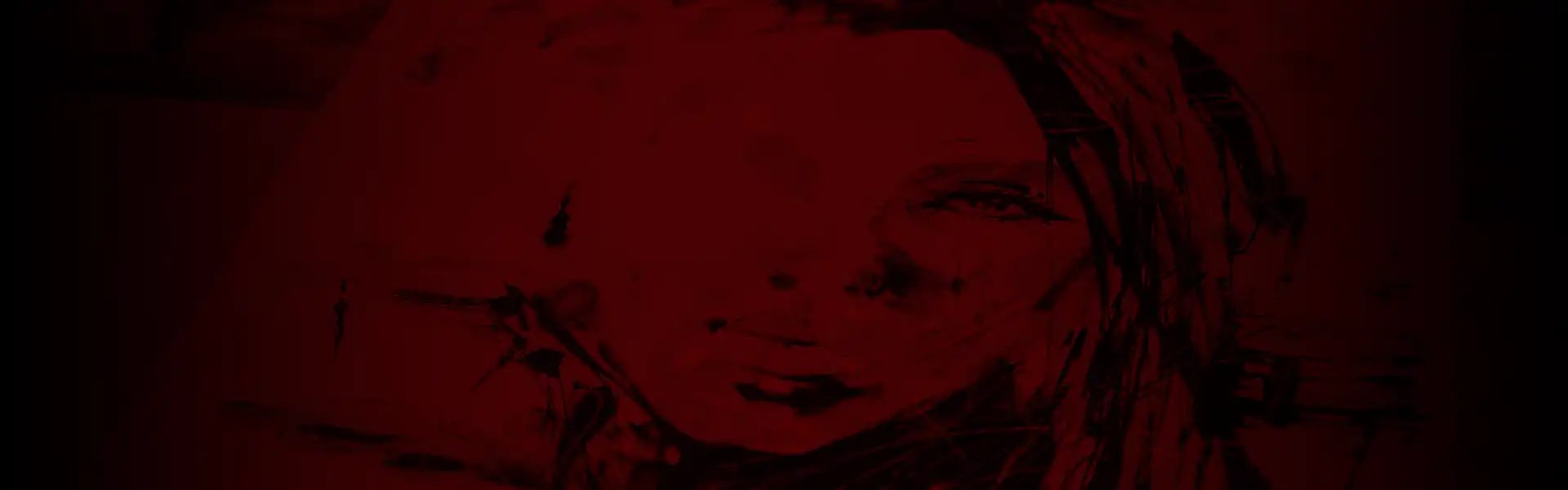
03. Acidic Hues

Are you ready to add some serious zest to your palette? Look no further than super bright acidic hues – the electric, eye-catching colors that are taking the creative world by storm. These hues are like a jolt of caffeine for your visual senses, injecting energy and excitement into any design.
From neon pinks and oranges to electric yellows and greens, these bold colors are perfect for making a statement. Whether you’re designing a brand identity, creating a mural, or putting together a social media post, these colors demand attention and leave a lasting impression.
And let’s be real, who doesn’t need a bit more brightness in their life? As we continue to navigate the ups and downs of this hectic world, a pop of acid green or fuchsia pink can be just the pick-me-up we need.
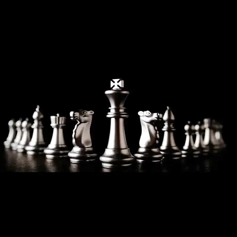
04. Silver Chrome

Say goodbye to traditional color palettes and hello to edgy and youthful vibes. Moody silver chrome is a statement, a rebellion, a call to arms for the anti-establishment folks out there.
So, if you’re looking to break free from the norm and express yourself in a bold and unconventional way, moody silver chrome is the way to go. Embrace your inner rebel and show the world that you’re not afraid to push boundaries and challenge the status quo. It’s not just a color, it’s a mood.
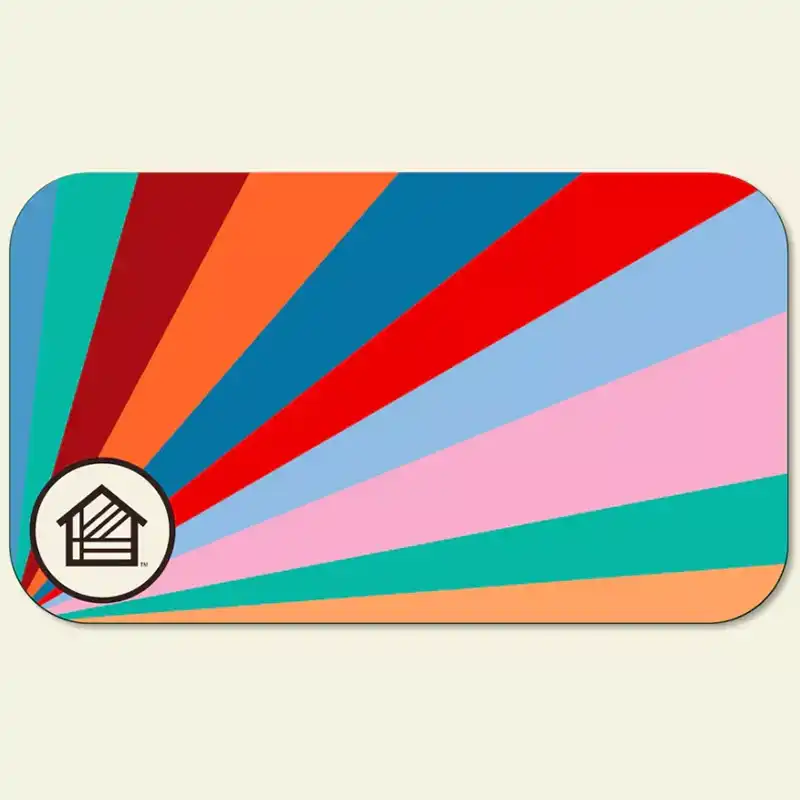
05. Millennial kitsch

Have you noticed that everything old is new again? That’s right, the millennial kitsch from 2022 is continuing this year. It’s like we’re taking a trip down memory lane, but with a fresh coat of paint.
Those bright, bold shades that were everywhere in the early 2000s are back and better than ever. Think electric blues, hot pinks, and lime greens. It’s like Lisa Frank threw up all over the design world, and we are totally here for it. These colors are so playful and nostalgic, they recreate the feeling of being in your childhood bedroom, surrounded by posters of your favorite bands.
Be sure to ask how we can work theses trends in to a redesign of your website or your branding